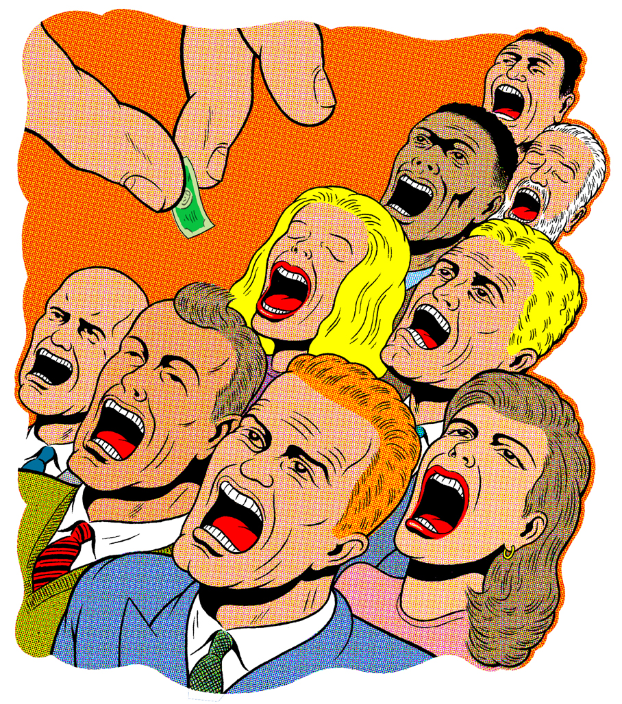
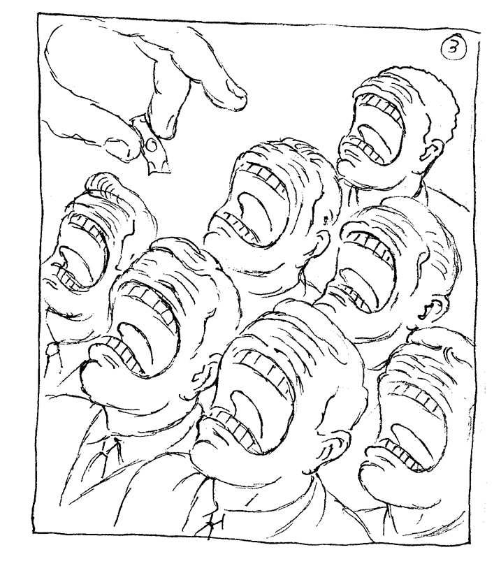
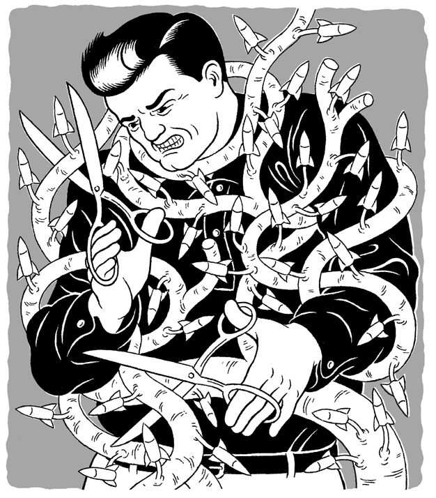
 Here's a recent illustration I did for BusinessWeek - always a fun client to work with. Below is the original concept I submitted, which I'm including because, personally, I think it's superior to the image that was finally agreed upon. The art director apparently prefered the original, as well, but the editors found it too spooky. Spooky or not, I felt it hit the mark more powerfully, and that spookiness simply gave it more teeth (no pun intended). Nevertheless, I was pretty happy with the results, despite the awareness that watering down a concept can often lead to a less interesting final product. Slightly evident here, stylistically speaking, is the recent influence on my commercial illustration work of the great comic artist, Fletcher Hanks, who, thanks to Paul Karasik's beautiful anthology, "I Shall Destroy All the Civilized Planets!", is now easy to find in print.

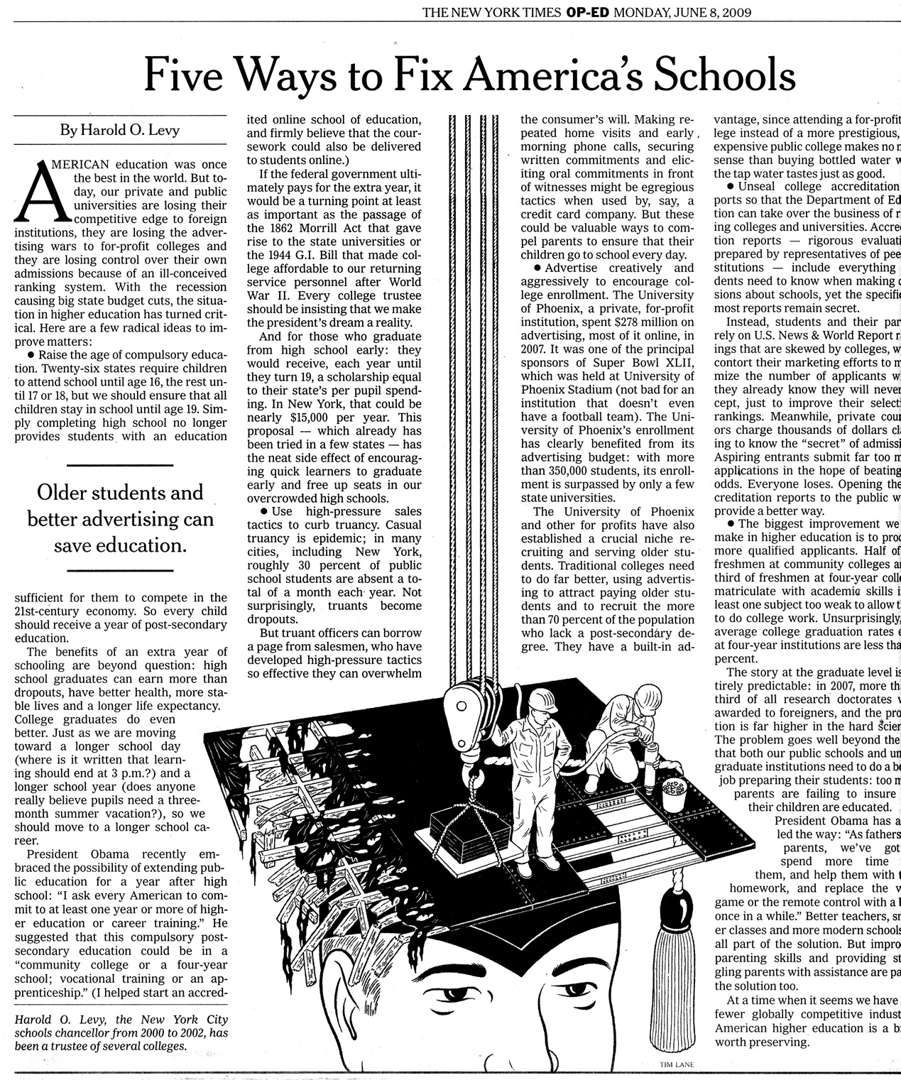
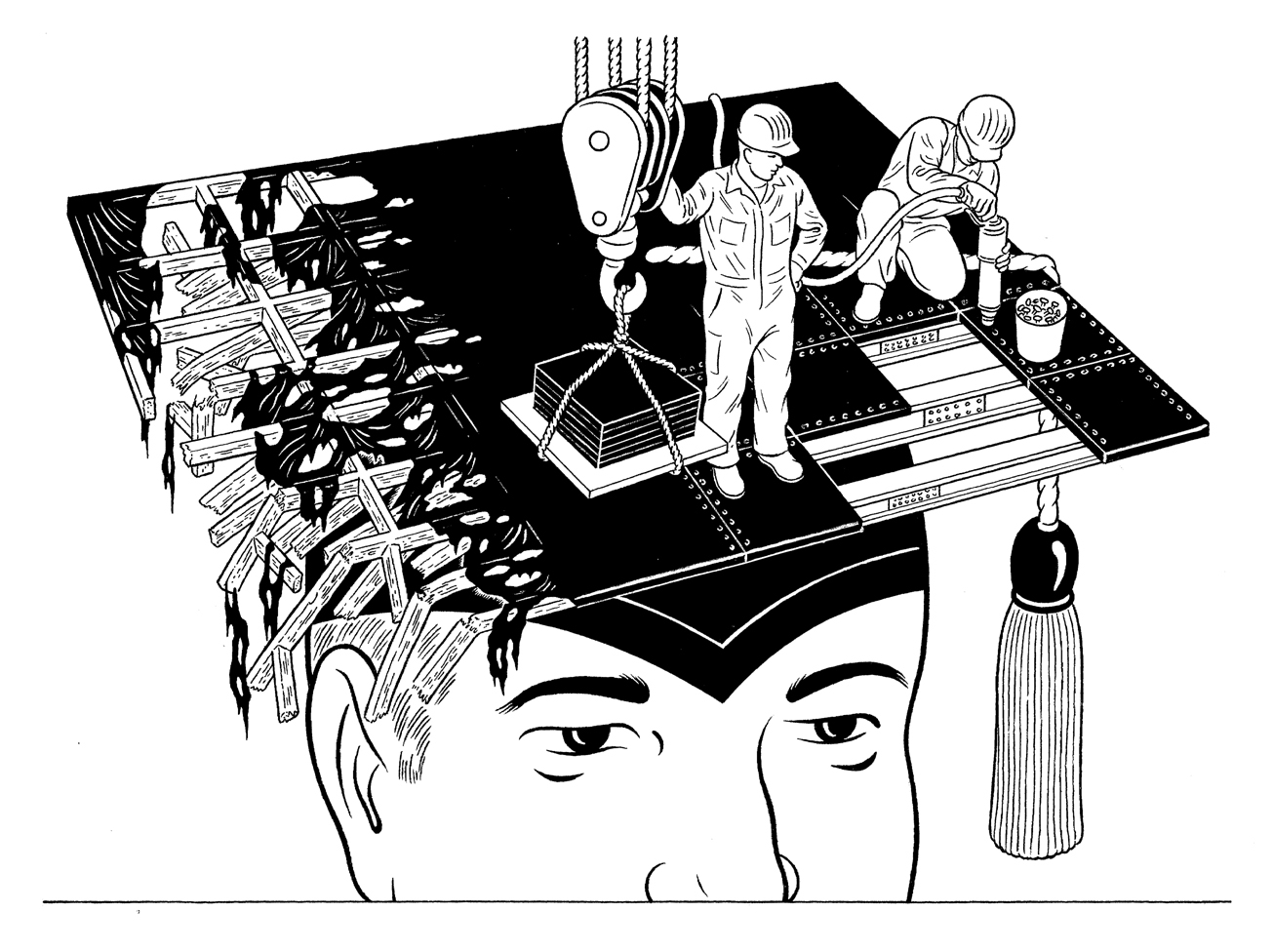 Here's my most recent OP-ED piece for the New York Times. Below is a scan of how it ran on the page.
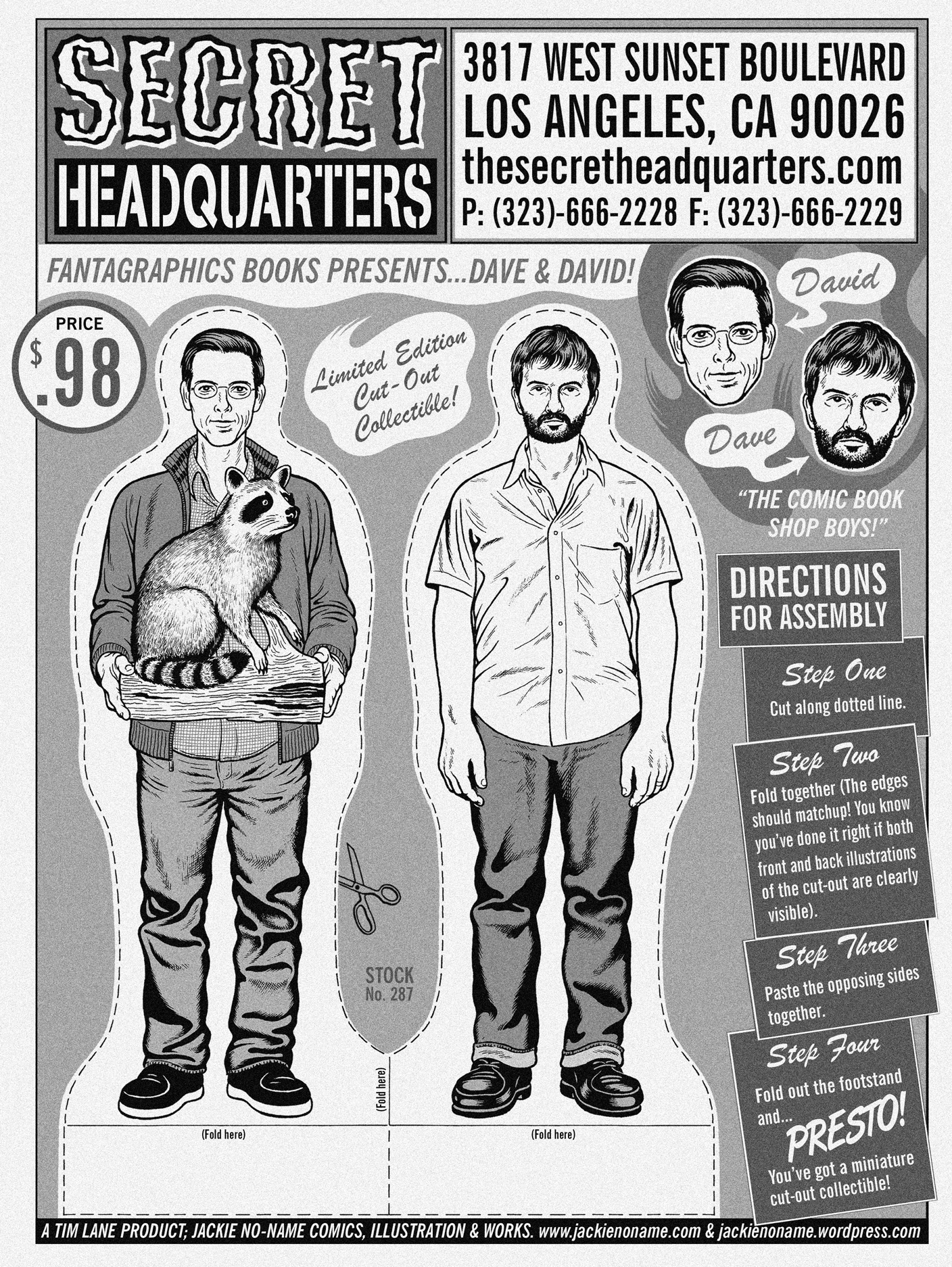 SECRET HEADQUARTERS is a comic book shop in Los Angeles, CA (check out there website at secretheadquarters.com). The owners, Dave & David, apparently liked the cut-out collectibles I produced for ABANDONED CARS, and asked me to create a limited edition collectible of themselves (and their mascot raccoon), in conjunction with Fantagraphics, for the promotion of thier store. The collectible "advertisement" will be printed on their sales bags, and also apparently included in a group of collectible stickers they're producing, as well. This was a fun project: I've always been interested in doing one of the cut-outs as portraiture upon request, and so here I got my chance. I also love to get the chance to produce the design work, and here I was shooting for a 1960's Big Daddy Roth inspired over-the-top toy packaging kind of look. Dave and David are a couple of very cool guys...if you're in the LA area, go give them some business! I'm trying to talk them into producing the cut-out as a life-size, full color lawn ornament. So, if you happen to go to there shop, please suggest to them how cool it'd be if they had one in their shop.

